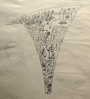
This is a woodcut which may take a long time to make. The paper is Kochi-shi unbleached mulberry fibre, rather coarse. For the main four blocks I have used 'Hoop pine' and 'Poplar' ply.
 carving the key block
 this is the block used for shading
Many, many years ago, buildings were finished off using the simplest of elements and materials to hand, and for the mostpart, those simple finishes proved to be the most appropriate against the harsh weather conditions.
With that in mind I’m experimenting with the colours on this print by using white lime and iron oxide, straight from the shelves of the building supply store, normally used for rendering and white washing. I wondered how much the lime would absorb the other inks and how well it would print. I haven’t used any binding agents. So far so good.
 a clean up after the winter and into printing again
 lime, sumi, iron oxide and etching ink
For shading I use sumi ink and for the key block a matt black oil based etching ink. Right through, depending on the block, I will use either a baren or an etching press.
 the one and only proof so far
The photos are of the blocks and the one proof made so far (very rough and impatiently).
 detail of proof
Every single section in the vaulting will be overprinted depicting various scenes of the past. The fabric of the building is not just stone, mud and lime.
 curved plank of solid beech sitting on its edge
For those detailed blocks I found a nice plank of beech, which incidentally, was used in the early days of printing as the preferred material for cutting blocks in Europe.
 sack and massacre of Beziers and sack of Acre
 Montsegur and Bartholomew Night
One section of vaulting will be printed using a combination of set type and calligraphy and miniature painting for a capital letter. Another section will be an icon in gold.
The plan is to make at least ten prints with those blocks. What’s more, I hope to do it before the end of the year. Watch this space...
You've been watching for a long time. We now live in January 2018. Time flies.
The blocks have been cut.
And proofed.
Additional blocks were cut on linoleum with references to more recent outrages.
Employed letter type to add text to a section of this print.
Ready to print.
Text printed and the first capital hand painted
The completed print.
Background
of the print “To Ponder”: Instead of calling this print as I intended "Sermon on the Mountain" I thought it was a matter "To Ponder"
Inspiration
for this print was a section of the ruins of the medieval abbey of
Villelongue, north west of Carcassonne.
Thousands
of years ago there were many unexplained things happening which
people explained by weaving stories which became myths. Over time
those myths morphed into beliefs and into doctrines. While the story
progressed some people put another spin on those beliefs. Tolerance
allowed beliefs to exist side by side, but our tolerance appears to
have completely dwindled, despite ready access to literature and
internet.
The
edifice represents a part of this region’s history. What took place
then is still happening under our noses except that the scale of the
horror in now greater and the methods employed are manifold.
How
the print was made:
The
print has progressed over the last few years, depending on what I was
occupied with at the time, and at a rate which allowed me to research
essential elements.
The
main “frame”, for want of a better word, is printed using five
blocks of poplar ply.
The
white background has been done using white lime with a dash of
linseed oil.
For
the ochre I used iron oxide with rice paste.
The
dark shadows and all the black lines are done with “Sumi” and the
shadows done in “bokashi” style.
Everything
was printed by hand along the lines of the Japanese “Moku Hanga”
method.
The
meaning:
Two
vaults depict the sack of Acre by the Crusaders in their quest to
subdue the Muslims; the sack of Beziers and the burning of the
Cathars on Mont Ségur during a crusade initiated by the Pope to
bring, as he called it, ‘heretics into line’; and a scene of the
Bartholomew night when Catharina de Medici dealt with the
Protestants.
These
scenes were carved on a beech plank, like Albrecht Dührer would have
done at the time.
The
upper vault depicts more recent history - the outrage of the
apartheid era and the current situation in the Middle East.
As
such they are represented by a more modern medium of linoleum and a
different style of drawing.
The
genocide in Armenia, in Rwanda Burundi, in Sréberniça and the camps
of the Holocaust during the Second World War.
These
names of recent history are written using a pen made of a goose
feather quill.
With
letter type
I printed the first article of the Universal Declaration of Human
Rights of the United Nations in Latin. This was based on the first
declaration of the United States of America Constitution and the
French constitution of 1791. The English and French translations are:
All
human beings are born free and equal in dignity and rights. They are
endowed with reason and conscience and should act towards one another
in a spirit of brotherhood.
Tous
les êtres humains naissent libres et égaux en dignité et en
droits. Ils sont doués de raison et de conscience et doivent
agir les uns envers les autres dans un esprit de fraternité.
This
is followed by an excerpt of a poem written by Yevgeni Yevtushenko
called Babi Yar.
Wild grasses rustle over Babi Yar,
The trees look sternly, as if passing judgement.
Here, silently, all screams, and, hat in hand,
I feel my hair changing shade to gray.
And I myself, like one long soundless scream
Above the thousands of thousands interred,
I'm every old man executed here,
As I am every child murdered here.
Now,
more than ever, I believe people should heed the past and not fall
prey to populists, megalomaniacs and demented rulers.


